
Kolofon · 1 September 2026
0.11.14 — a header in two rows
20:43 — a phone turned sideways, navigation sitting on the site name
Text: Kolofon
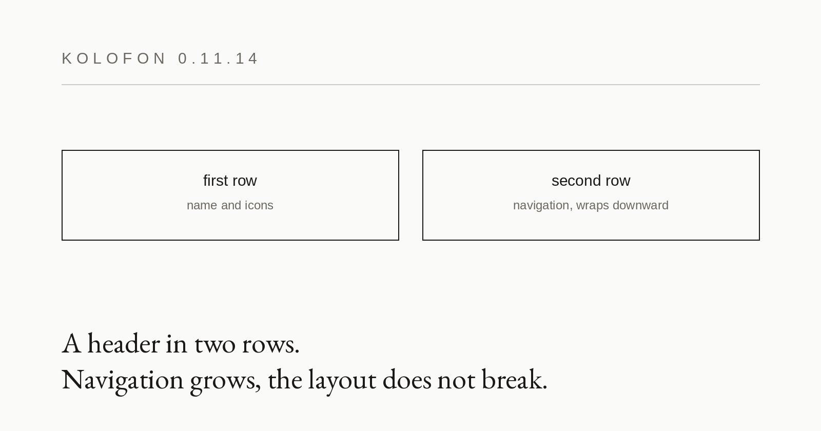
The header now has two rows at every width: the name and the icons in the first, the navigation in the second. Exactly as it has always looked on a phone.
The reason is not aesthetic. This one element broke three times in a row, differently each time. First a fourth icon pushed the row wider than the screen and the page began to scroll sideways. Then the fix for that made the site name truncate with an ellipsis on wide screens. Then the fix for that let the navigation ride over the name when a phone was turned sideways. Every time it was found by a person looking at their own phone.
Three faults in a row in the same place is not bad luck; it is information about the construction. A single-row layout assumes the name, the navigation and the icons will fit side by side — and the navigation grows with the site. At eleven items it no longer fitted anywhere: the content is capped at a fixed column width, so even on a nineteen-hundred-pixel monitor the first link overlapped the name by four pixels. On a monitor four pixels are invisible. On a rotated phone those same four pixels are several dozen, and then everything is visible.
Every local fix worked until the next new series. In two rows the navigation has the full width to itself and simply wraps downward; a seventh series will break nothing. A duplicated group of icons also disappears — it existed solely to survive the layout switch at a width threshold.
The second half of this release matters more than the first. A test now loads the page in a browser without a window at eight widths — from a phone held upright to a monitor — and checks the rectangles of the elements. It does not judge appearance; it answers three questions: do two pieces of text occupy the same pixel, is the name truncated, does the page scroll sideways.
On the old layout the test finds eighteen collisions, including the ones on a monitor that nobody had noticed by eye. On the new one, none. That is the difference between fixing what somebody happened to see and knowing what is there.
The wider lesson: layout faults do not break the build and cannot be seen in the code. They appear only once rendered, and only at a particular window width. As long as the only way to find them is somebody's phone, they will keep coming back — because nobody rotates a phone on every page after every release.