
Kolofon · 4 September 2026
0.11.22 — the header above the image
after an entry with a photo looked different from one without, in the same column
Text: Kolofon
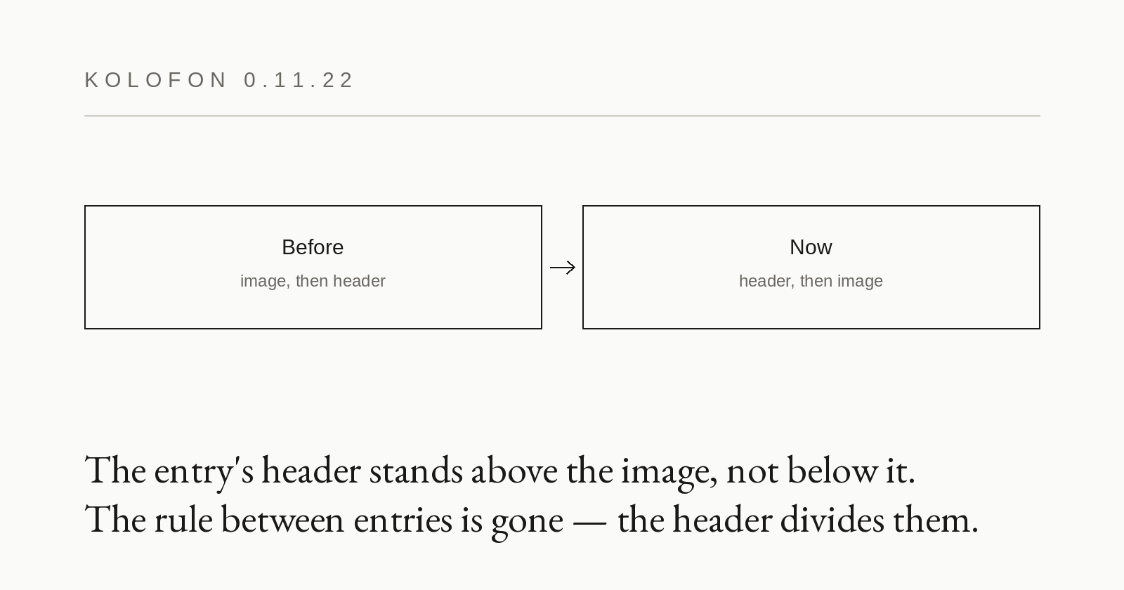
The header — series, author, date, rating — is the entry's sign. It says whose this is and where it comes from, before the reader decides whether to go in. In the grid it has stood above the image since 0.11.20. In a single column it did not: there the image came first and the header arrived below it, together with the title. Entries without a photo carried it at the top, entries with a photo carried it in the middle — and both orders were visible on one screen at once.
The fix is a reordering, not a rewrite. The header leaves the content block and stands before the image in each of the three branches of the single-column layout: an ordinary entry, an outgoing entry, an entry with an embedded recording. Exactly where it already stood in the grid. One element has one place, whatever the number of columns and whether or not the entry has an image.
The rule between entries goes with it. It was needed as long as the list began with an image or a title — something had to say where one entry ended and the next began. The sign does that better, because it carries meaning: a series name and a date are a boundary in themselves. A line above the header said the same thing twice and looked like a leftover from a layout that no longer exists.
The spacing between entries is unchanged — that, and not the line, is what gave the list its air.